GANGA TATTOO
We created a focused, mobile-first landing page for Ganga Tattoo LA with a clean visual structure, strong portfolio presentation, and a clear booking path. The goal was simple: make the studio’s work feel premium online and guide potential clients from discovery to consultation with less friction.
PROJECT OVERVIEW
Ganga Tattoo LA needed a landing page that could quickly communicate trust, quality, and artistic value. In the tattoo industry, first impressions matter. Potential clients often decide within seconds whether a studio feels professional, premium, and worth contacting.
Our objective was to design a tattoo landing page that worked as both a visual portfolio and a conversion tool. Instead of creating a heavy website with too many sections, we focused on a clear, direct landing page experience that highlights the studio’s work, explains the value, and makes it easy for users to take action.
The final result is a modern, responsive, and conversion-focused landing page built for a Los Angeles tattoo studio with a strong visual identity and a smooth path toward booking.
.avif)
Our Approach
The main challenge was creating a landing page that felt premium without overwhelming the visitor.
We designed the page with a focused structure that moves the visitor from interest to action. Every section was created with a purpose: introduce the studio, showcase the tattoo work, build credibility, and drive users toward the booking flow.
The layout avoids unnecessary distractions and keeps the user focused on the artwork and the next step.
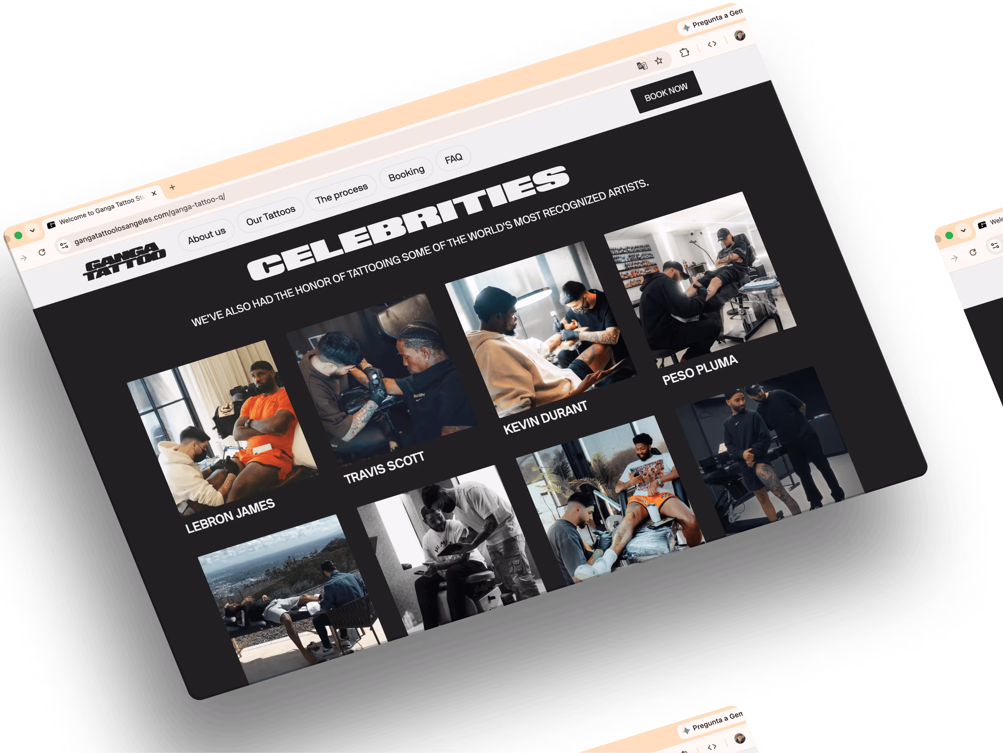
For a tattoo studio website, the work needs to be the center of the experience. We created a visual-first layout that gives the artwork enough space to feel premium, detailed, and easy to explore.
The landing page was designed to feel more like a curated tattoo portfolio than a generic service page.
Most tattoo clients discover studios through Instagram, Google, or mobile search. Because of that, the landing page was designed with mobile performance and usability as a priority.
We optimized the structure for fast scanning, easy navigation, and clear calls to action on smaller screens.
A landing page should not only look good it should guide users to take action. We simplified the user journey and placed clear calls to action throughout the page to help visitors request a consultation or start the booking process.
The result is a smoother experience for potential clients and a more effective lead-generation tool for the studio.
.png)
The Results


Discover More High Performance, Website Projects
See how we’ve helped brands grow and succeed.
.avif)